Challenge
The main challenge was to create a distinctive visual identity for a small and relatively unknown tourist destination – South Bilogora. The goal was to build recognition, capture the essence of the region, and design a logo that contributes to shaping its image in the tourism market.
The main challenge was to create a distinctive visual identity for a small and relatively unknown tourist destination – South Bilogora. The goal was to build recognition, capture the essence of the region, and design a logo that contributes to shaping its image in the tourism market.
Solution
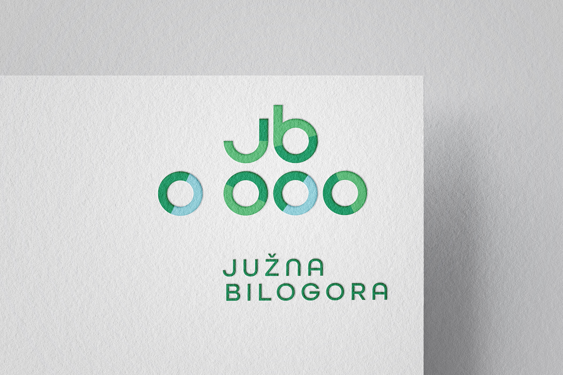
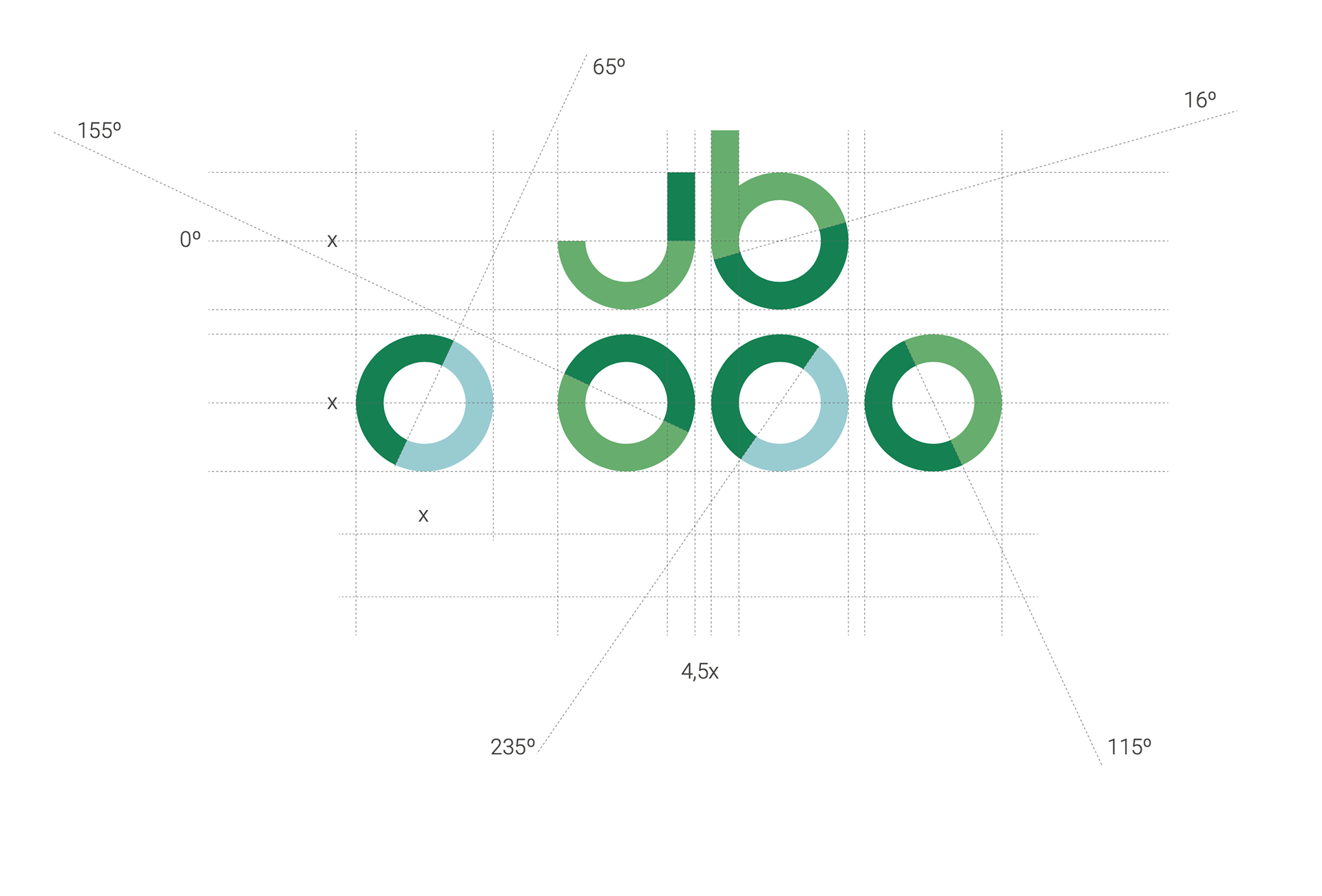
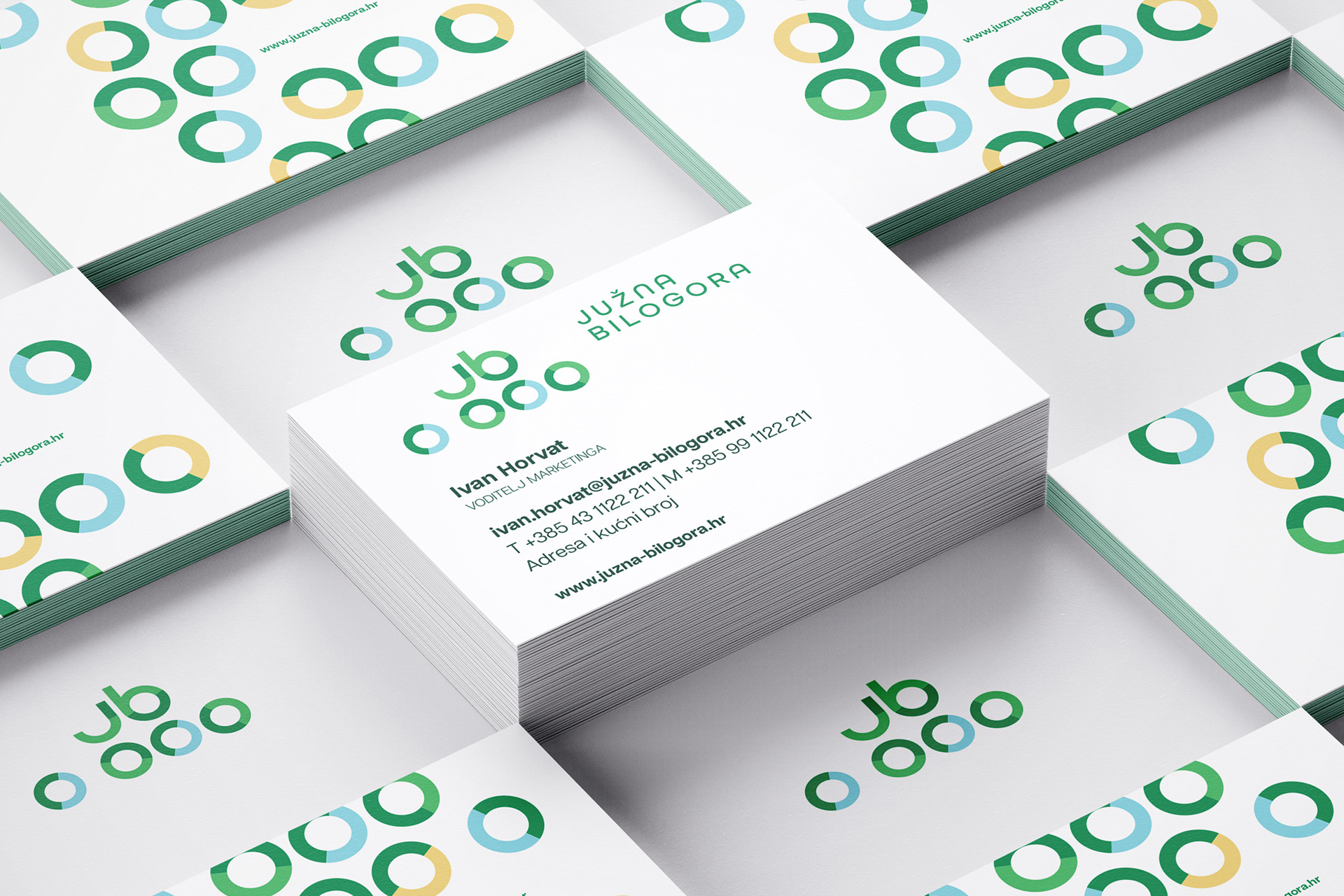
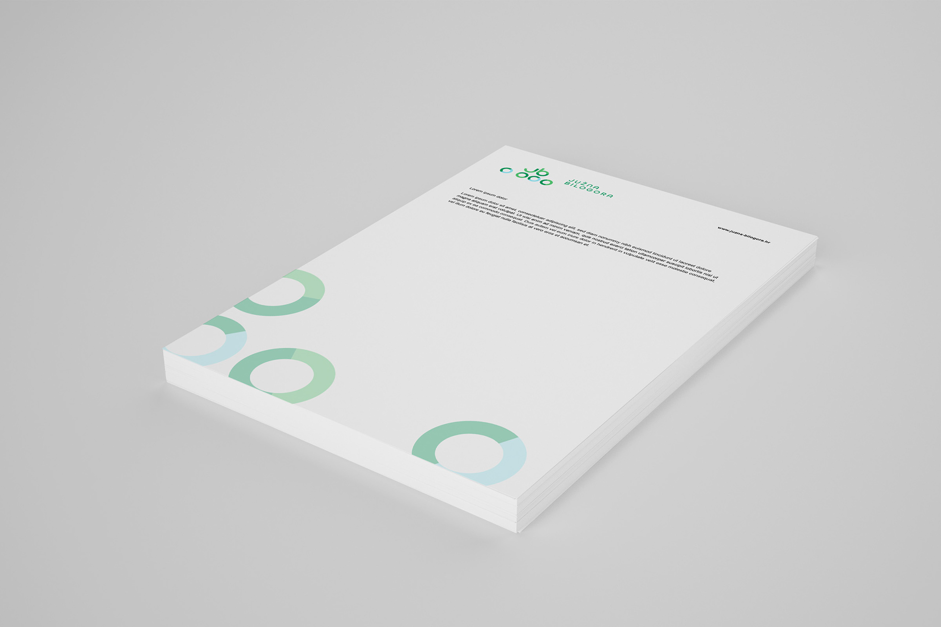
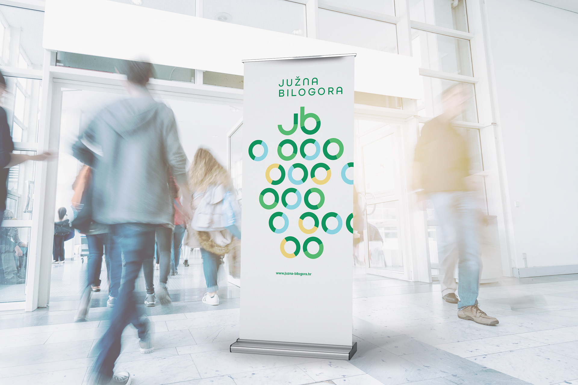
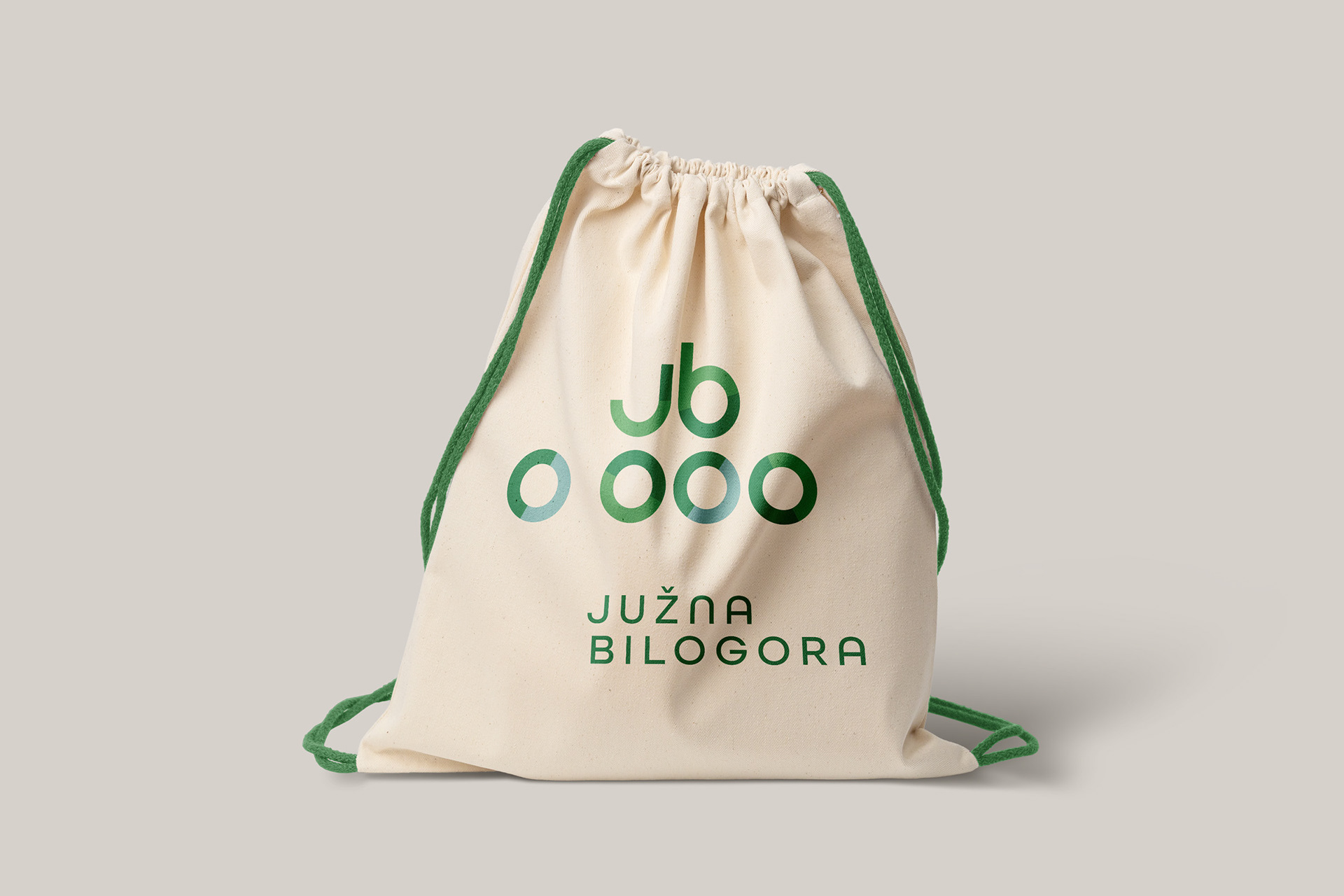
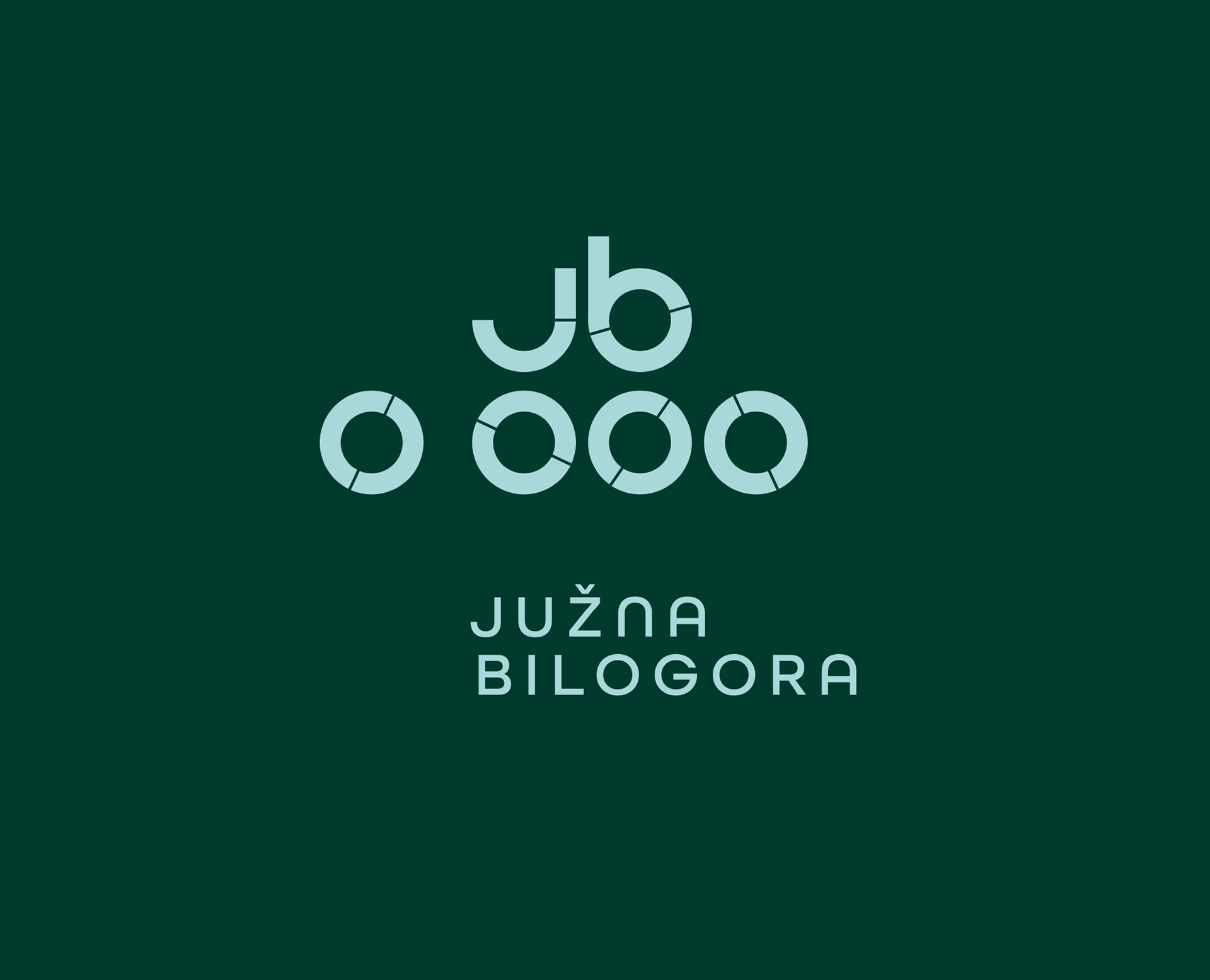
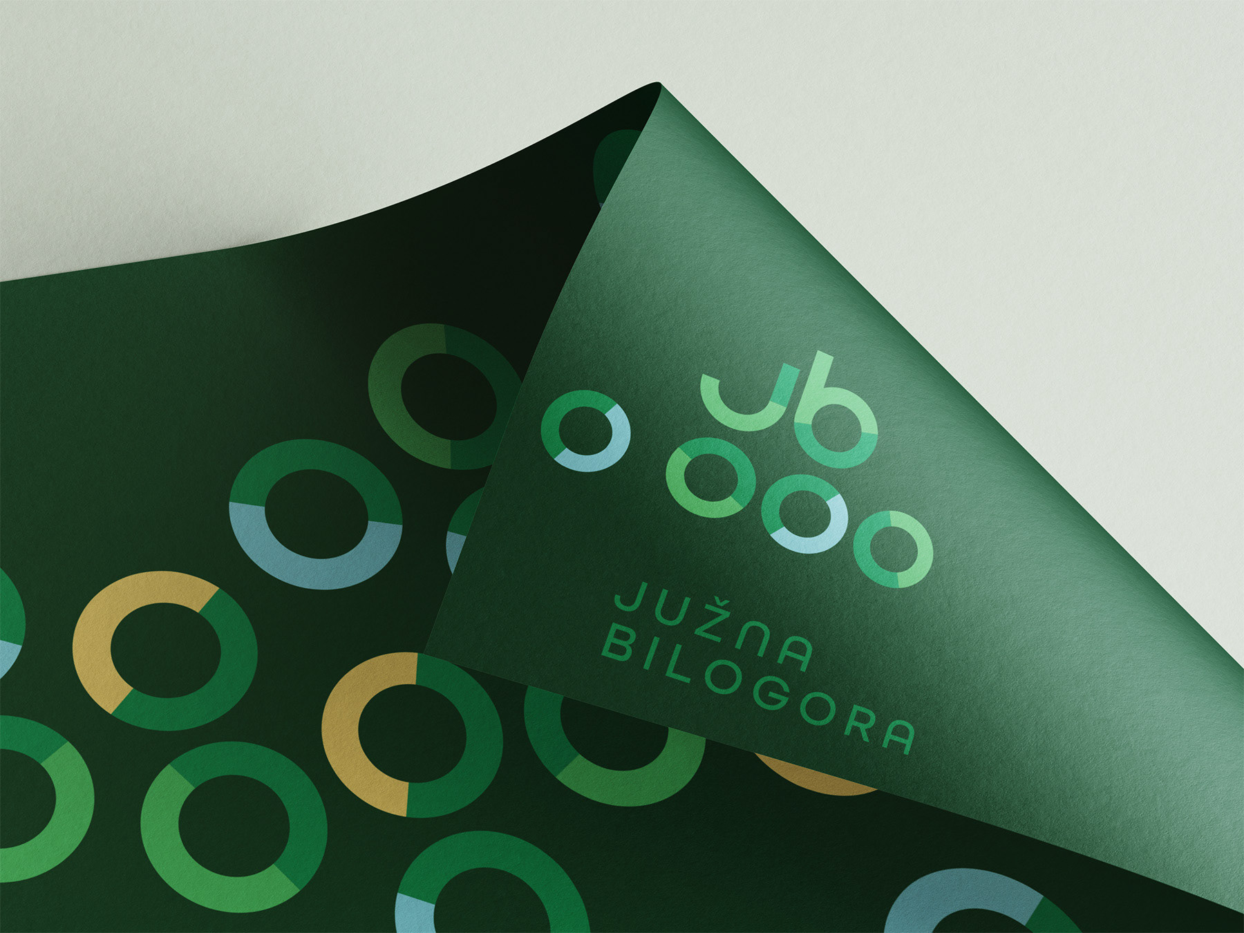
For the visual identity of the South Bilogora Tourist Board, the design concept drew inspiration from one of the region’s most iconic figures – writer Mate Lovrak and his timeless children’s novel “The Train in the Snow.” The central motif of the logo interprets locomotive elements in a clean, geometric style, combined with green and blue as symbols of nature and the local environment. The concept is completed with All Round Gothic typography, whose rounded forms harmonize with the logo mark, creating a cohesive and memorable visual identity.
For the visual identity of the South Bilogora Tourist Board, the design concept drew inspiration from one of the region’s most iconic figures – writer Mate Lovrak and his timeless children’s novel “The Train in the Snow.” The central motif of the logo interprets locomotive elements in a clean, geometric style, combined with green and blue as symbols of nature and the local environment. The concept is completed with All Round Gothic typography, whose rounded forms harmonize with the logo mark, creating a cohesive and memorable visual identity.
Project made for: Logic Marketing
Client: Južna Bilogora